November 9, 2011
Usability & UX: Forgotten in Obesity Web Intervention?
A group of researchers in the Netherlands just published the results of their web-based adolescent obesity intervention. This kind of intervention is promising because it scales well: more users on a website are essentially free, while adding people to an intervention that requires doctor visits would be much more expensive.
Scaling is important because reaching a significant portion of the large number of obese people (e.g. 1/3 of US adults) will be cost-prohibitive with an intervention that is expensive to scale.
But scaling well only matters if the intervention is effective. Unfortunately for the Netherlands intervention, after two years there was no positive effect on the physical activity, diet, or BMI of the children who participated.
Where’s the usability testing?
Why wasn’t the intervention effective? The authors offer some possible explanations, such as its short duration (“8 sessions of 15 minutes each within 10 weeks”). However, there was no mention of any usability testing, and poor usability could torpedo a web-based intervention just as easily as any other website.
Tools for improving intervention websites
There are a number of tools used especially by web startups that could be beneficial to web-based interventions for obesity and other diseases.
- A/B testing
This is essentially a usability mini-study: visitors to your site see either site A or site B. Ideally, you want site A and site B to differ only a little bit (e.g. color of the “sign up” button).
Business track response rate (e.g. signing up for a free trial); researchers could do this in focus groups and track responses to feedback questions. - Usage statistics
There are a bunch of great tools for collecting usage statistics. Google Analytics is widely used for collecting all kind of statistics about your website’s users (e.g. time spent on pages, search terms used to find your site, etc.).
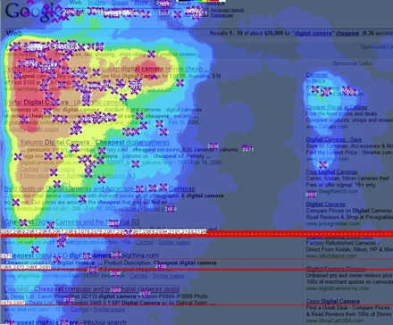
One kind of usage information that could be extremely useful are heatmaps that shows where users click on a page:
(Image from Flickr/labnol.)
Analytics companies such as ClickTale and Clickdensity can generate click heatmaps from any website. - Session tracking
There are some services that can help you do more in-depth tracking of what a user does on a website. For example, OpenHallway and Silverback let you record a user’s screen and voice (and face, in the case of Silverback) while they test your website and play the recordings back later.
User experience really matters
Users form first impressions of a website in only 50 milliseconds, and this first impression matters:
The lasting effect of first impressions is known to psychologists as the ‘halo effect’: if you can snare people with an attractive design, they are more likely to overlook other minor faults with the site, and may rate its actual content (such as this article, for example) more favourably.
Especially with self-directed web-based interventions, the intervention’s website is directly competing with the other media available to the participant, i.e. everything else on the internet. It’s not surprising that dropout rates are high for web-based interventions.
It seems that good design and usability are necessary, though certainly not sufficient, for long-term success with web-based chronic disease interventions. I’m going to be on the lookout for studies that include rigorous usability testing.
Citation for the Netherlands study:
Ezendam, N. P. M., Brug, J., & Oenema, A. (2011). Evaluation of the Web-Based Computer-Tailored FATaintPHAT Intervention to Promote Energy Balance Among Adolescents: Results From a School Cluster Randomized Trial Archives of pediatrics & adolescent medicine. doi:10.1001/archpediatrics.2011.204
Comments? Please send me a message.