December 24, 2014
Data Visualization: Alcohol Consumption by Country
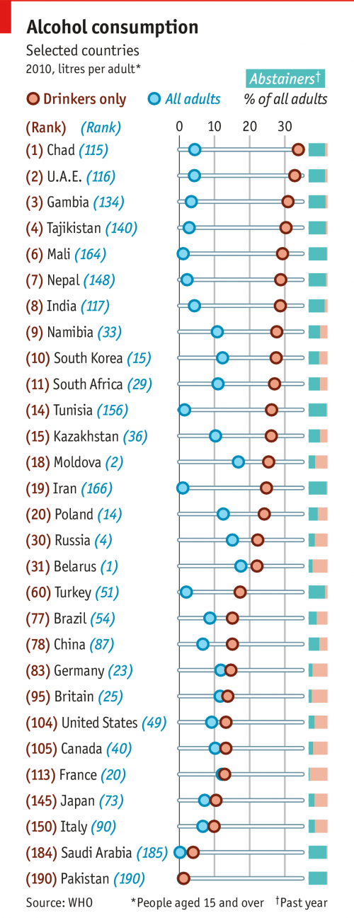
I saw this great graphic below in this morning’s Economist Espresso. It’s showing average alcohol consumption by country for all adults, and then for drinkers only.
This is an excellent example of why it is important to look at the distribution of data behind summary statistics. In this case, just looking at the average obscures the (alarmingly) heavy drinking among drinkers in some countries.
This graphic shows this clearly and concisely. It also makes good use of small multiples for showing the relative number of drinkers and abstainers in each country.

Comments? Please send me a message.