Making Effective Slides for Presentations
Last updated: January 18, 2021

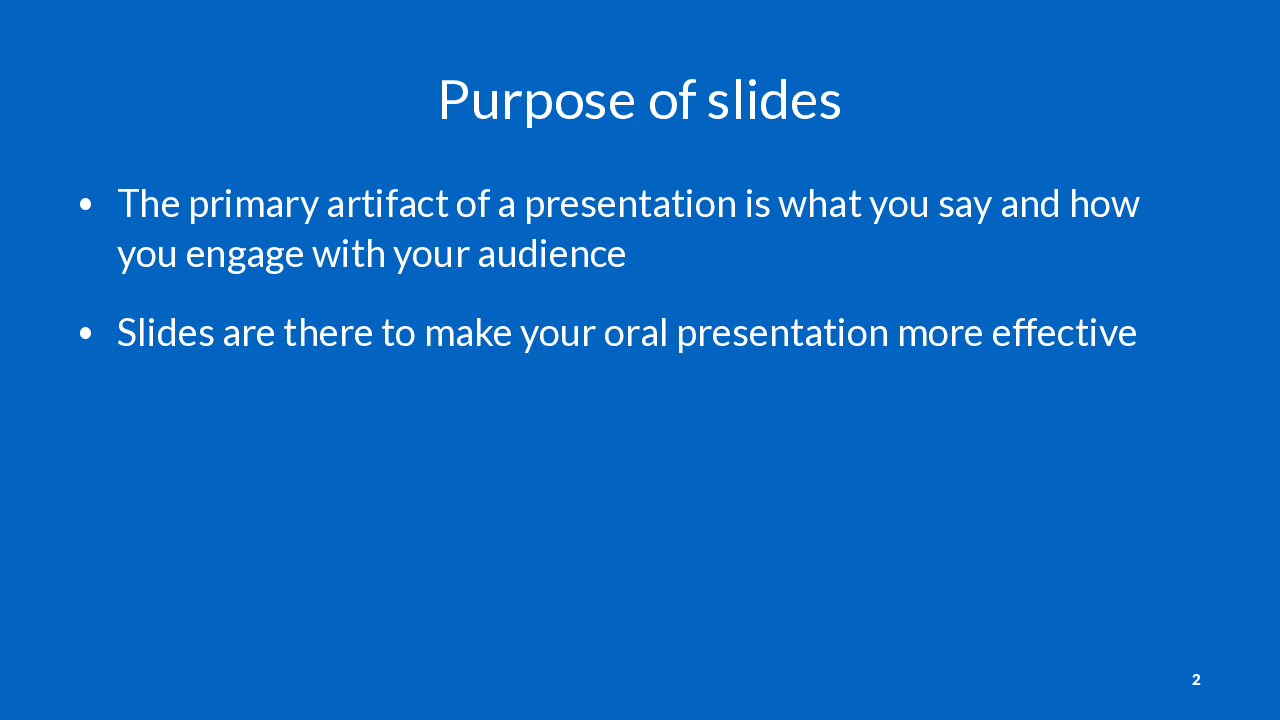
These slides are about making slides to support an oral presentation in a business or academic context. This is distinct from slide decks that are meant to stand alone. This is common in some companies like McKinsey (example).
The worst thing you can do is have your slides detract from what you are saying. This is why it’s important to avoid distracting content in your slides, and carefully edit them.
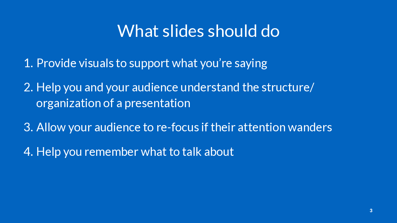
Many slides in a good presentation will make no sense without the speaker notes.

This is an example of one of my slides from a presentation on data visualization. It’s a very effective slide (I promise), but makes no sense without the context of my speaker notes.

Use speaker notes for providing additional information you plan to deliver orally.
Note: this presentation format uses speaker notes for the right sidebar. I first saw this format on this site, and I think it is quite effective at providing a written alternative to a live talk or video recording.
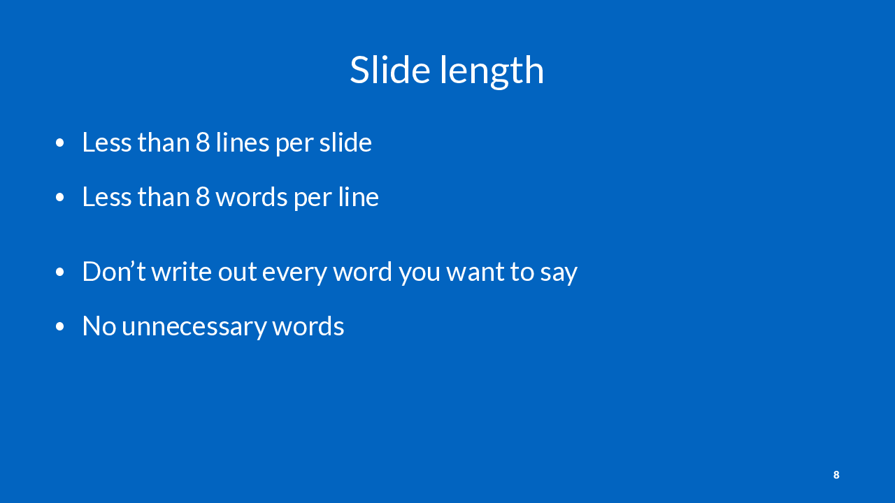
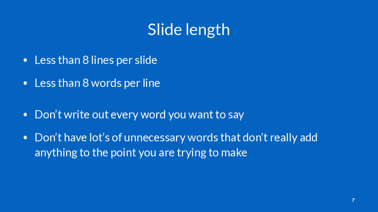
More than 6-7 lines per slide, or words per line is hard to read and boring.
It’s often possible to trim down the number of words on a slide without losing much meaning.
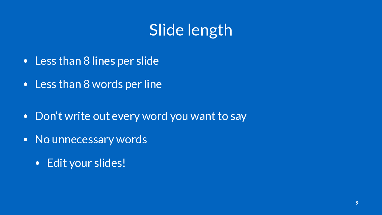
This means that you should edit your slides, just like you would edit a written document.
Slides are free. You can have lots of them! Fewer words = more attention on those words.

One thing I like to do for graphs is to circle one data point on the graph, and have the interpretation written on the slide. This is helpful because if someone is stuck trying to understand your graph, they won’t be able to listen to what you’re saying.
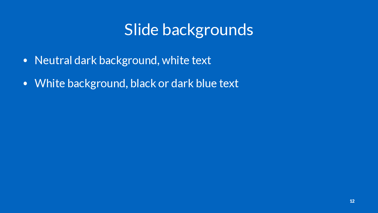

“Keep it simple” means avoid the visual clutter often found in fancier PowerPoint templates.
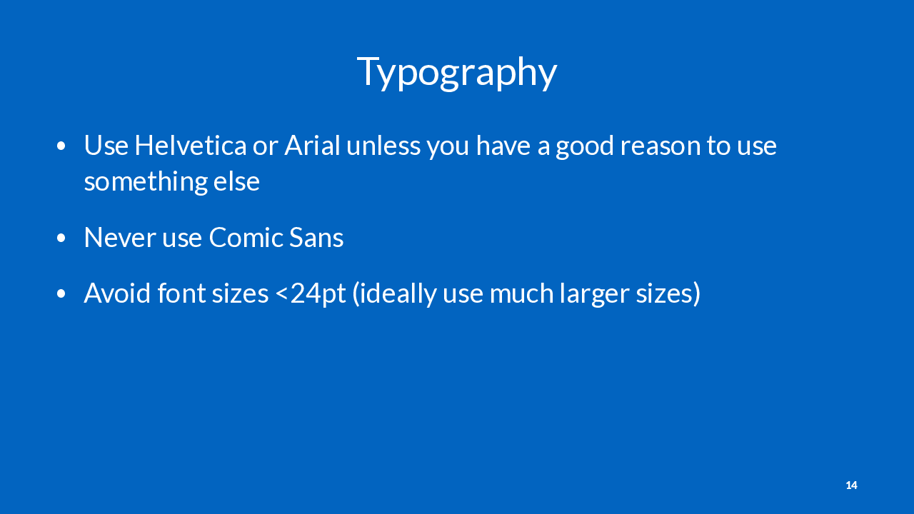
There is a strong convention to use a sans-serif font like Helvetica for on-screen words. Serif fonts are typically reserved for printed materials. Don’t break this convention unless you have a good reason to.
I personally strongly dislike Calibri (/kəˈliːbri/), the default font in Microsoft Office. However, this is just my own opinion and you should feel free to use it (if you hate me).

If I was showing a slide like this, I would say the following:
This graph shows __ on the x axis and __ on the y axis.
If you look at the circled point, you can see this means ___.
Source: Masnick M. Unpublished data.
How many tables rows and columns you can reasonably fit on a slide depends on a bunch of things: the aspect ratio of your slides, your font sizes, padding inside table cells, theme, etc. Just be aware that complex tables are never going to be understood by your audience during a presentation unless you spend a lot of time on them.
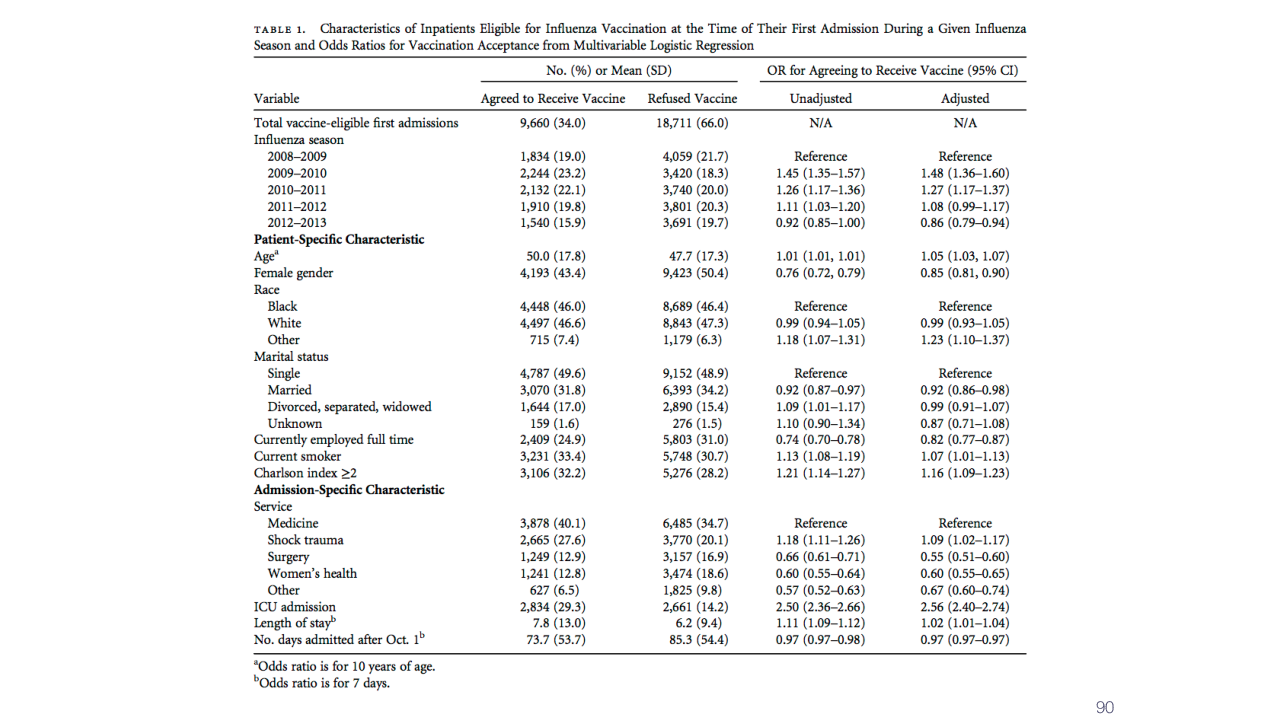
This is an example of the kind of table you should not put up on a slide in a presentation. No one can read it!
If you need to show a slide like this, zoom in on the important part in a subsequent slide.
You can also show a slide like this just for a few seconds so you can explain the source, and then show a different view of the data on a subsequent slide.
But don’t ever say, “I know this slide is hard to see” and then proceed to talk about the slide no one can actually see. Either make a version that’s legible or don’t display it at all.
Source: Masnick M and Leekha S. Frequency and predictors of seasonal influenza vaccination and reasons for refusal among patients at a large tertiary referral hospital. Infect Control Hosp Epidemiol 2015.
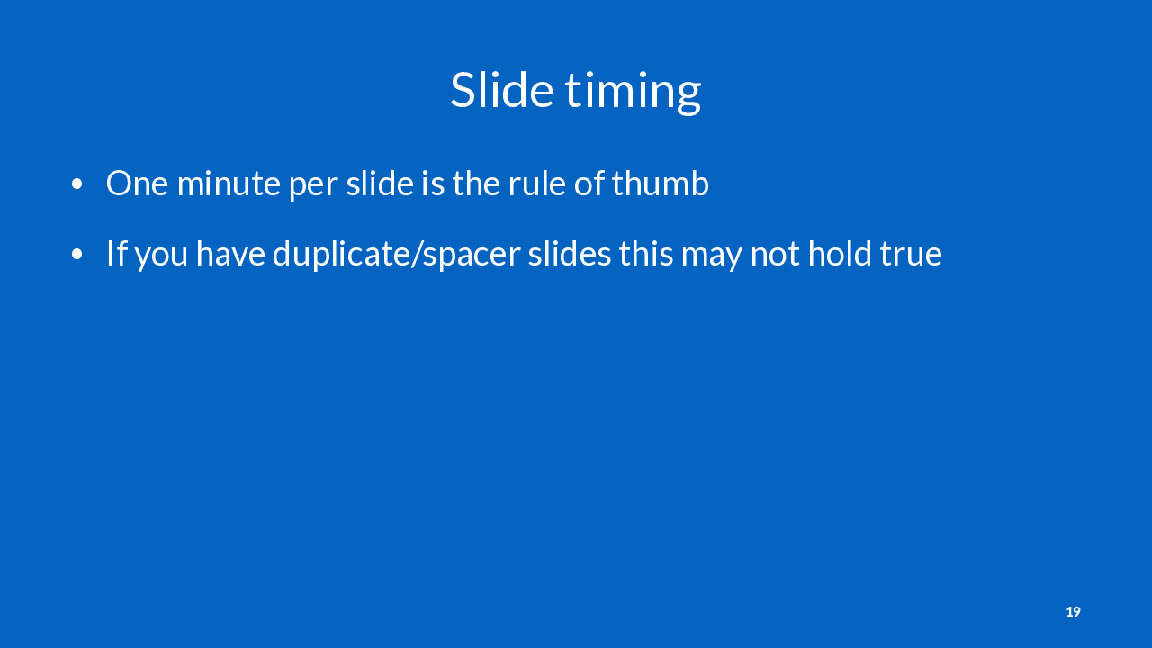
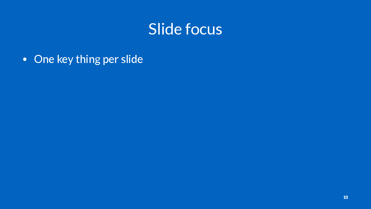
This rule of thumb may not make sense for all slides and presentations, but if you find yourself spending more than a minute on a slide, you should at a minimum think about whether there’s a different way to present the information on your slide.
Remember, too much information on a single slide will fragment your audience’s attention.
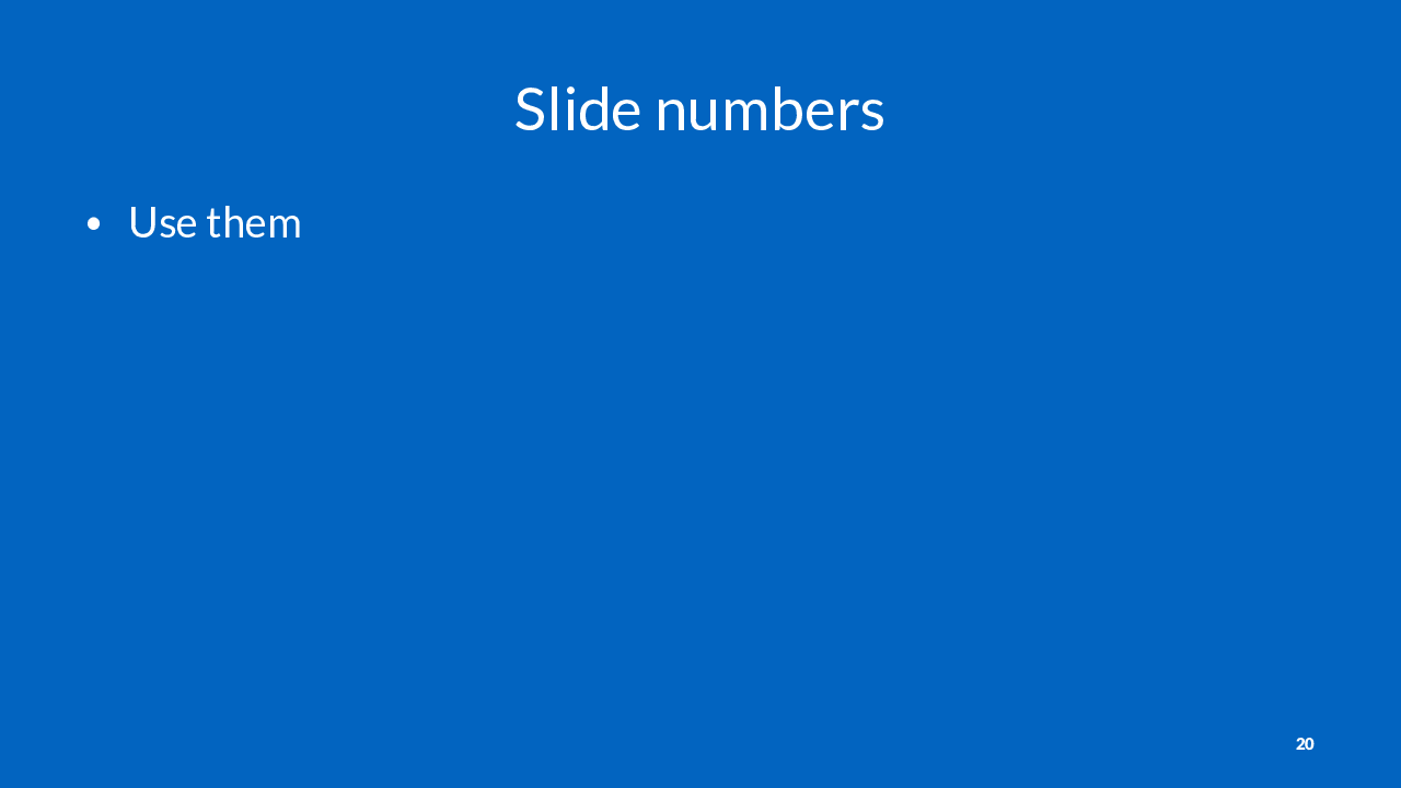
Always use slide numbers unless instructed otherwise. They are helpful for people who want to take notes or ask questions later.
In some contexts, like for non-technical keynote presentations, slide numbers may not be appropriate. You can always ask an event organizer if they prefer no slide numbers.
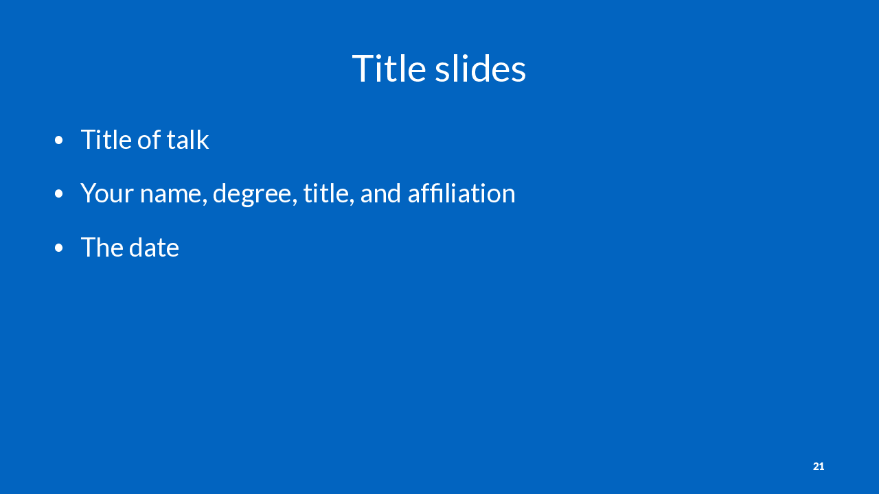

Here’s an example of a pretty standard title slide for presenting to an unfamiliar audience or for an academic context.
For presenting to people you work with regularly, you can just have your talk title, name, and date. You don’t need your degree, title, and affiliation.
For presenting to a larger group inside your business who you don’t regularly work with, it may be helpful to have more information about how you fit into the organization. For example, “Dept. of Slides, Information Sciences Unit”. You don’t need the full business name if everyone already knows you work there. You should include your full name, degree, and title if there are people in the audience who don’t know you.
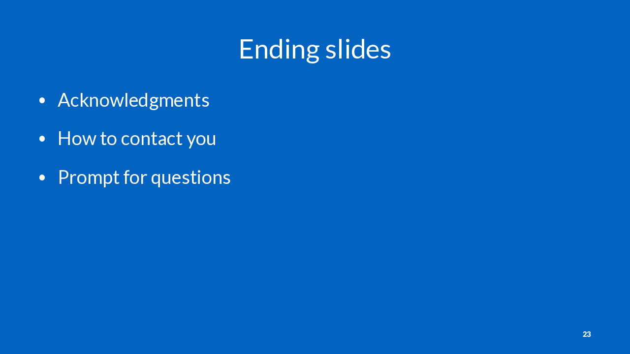
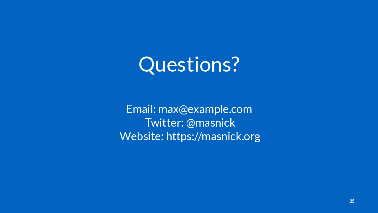
Here’s an example of a good final slide. It clearly prompts the audience that I am open to taking questions.
It also has my contact information on it, which is helpful for anyone who may want to follow up.
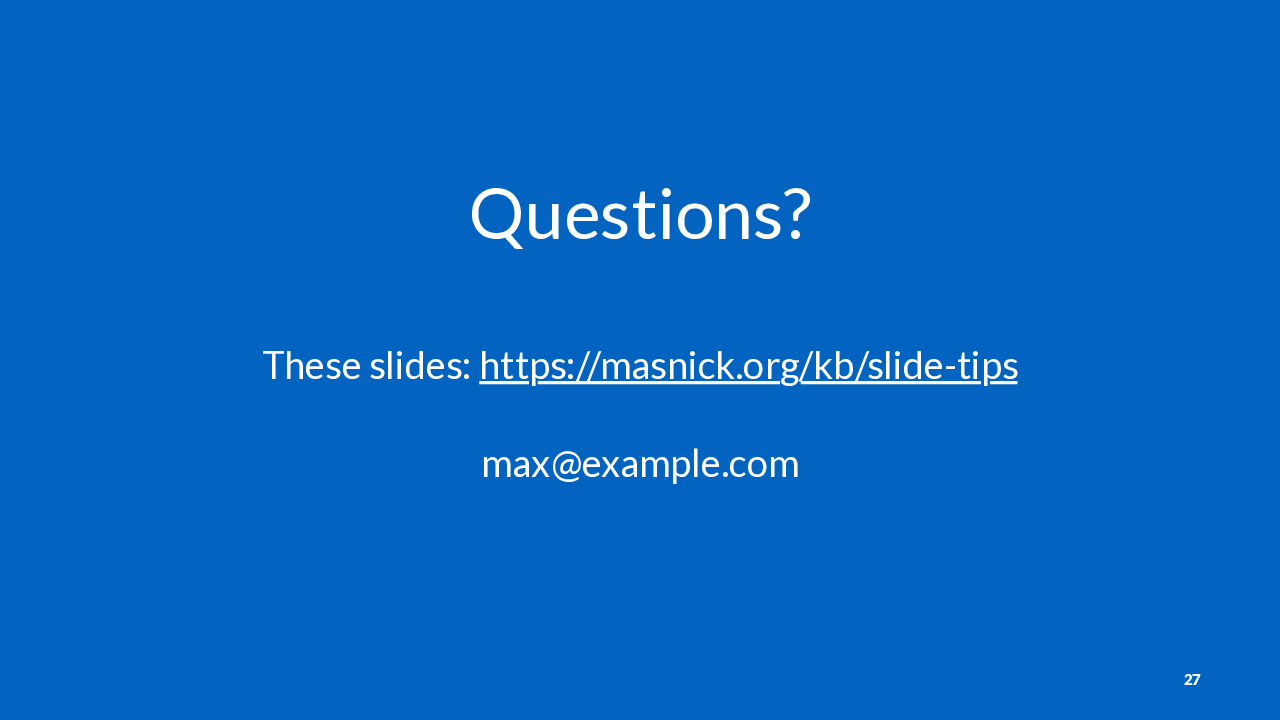
Here’s an example of another final slide that does this.
Consider using a URL shorter like https://bit.ly if you don’t have a relatively short link to your slides. Remember that people in your audience may be writing down the URL on paper!
If you do have a URL or contact information on your slides, make sure it is large enough that someone in the back of the room could photograph it clearly with their phone camera.