Choosing Colors
Details
Edward Tufte suggests being careful with color as it can often be a “graphical puzzle” (The Visual Display of Quantitative Information, 2nd Ed., p. 154).
Using color to represent data
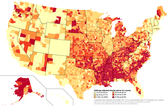
Colors are often used as a shorthand for representing values in data. For example, the map below uses color to to represent obesity rates in each county in the United States:

When colors are used in this way, they should have an obvious ordering (Envisioning Information, p. 92). In the example map above, the color scheme is six steps along a gradient from light yellow (low obesity rate) to dark red (high obesity rate). If you pick out any two of these colors, you can easily determine their ordering without the legend.
By this logic, you should not use a series of colors with inherent meaning that does not match the data. For example, using green, yellow, and red implies a gradient from good to bad; these colors should not be used in a series unless the data also have this pattern.
Also, do not use ROYGBIV to represent data. It is difficult to remember the order these colors are supposed to appear (Envisioning Information, p. 92).
Even if your color scheme is clear, colors should not be the only way for your viewer to determine values of data. This is because perception of a color is dependent on the other colors around it (Envisioning Information, p. 92). Therefore, you should always include labels or a legend.
Alberto Cairo suggests using 2-3 main colors, and then using shades of these main colors if more colors are needed The Functional Art, p. 175.
Be wary of using more than 4 colors to differentiate between categories in graphics. Remembering what each color represents occurs in “visual working memory” in the human brain The Functional Art, p. 138, which has a limited capacity. Thus, viewers will have trouble keeping more than 4-5 colors straight without constantly referring to legends or labels.
Tufte generally uses neutral colors like gray and brown as the primary color in his own graphs (Envisioning Information, p. 90). He will then use brighter colors, like blue and red, to highlight important elements of data. Below is a chart inspired by Edward Tufte (made by Alex Bresler) that demonstrates such a color scheme.
Big areas of color
Edward Tufte has some specific advice for figures involving large areas of color (Envisioning Information, p. 82):
- Don’t use loud colors over large areas next to each other.
- Don’t use light/bright colors next to white.
- Backgrounds should be gray or a muted color mixed with gray.
- Avoid multiple large, enclosed areas filled with different colors.
Colorblindness
There are three kinds of colorblindness (see this Wikipedi article for a detailed explanation).

It is worth considering this when making figures:
If a submitted manuscript happens to go to three male reviewers of Northern European descent, the chance that at least one will be color blind is 22 percent. (Source: Nature Methods.)
There are two good resources for finding color schemes that are colorblind safe:
- ColorBrewer allows you to construct color schemes or gradients of colors based on a number of criteria, including being colorblind safe.
- Color Oracle allows you to simulate colorblindness on your computer to test out a color scheme. The color wheels above were created using Color Oracle.