Gridlines in Graphs
Details
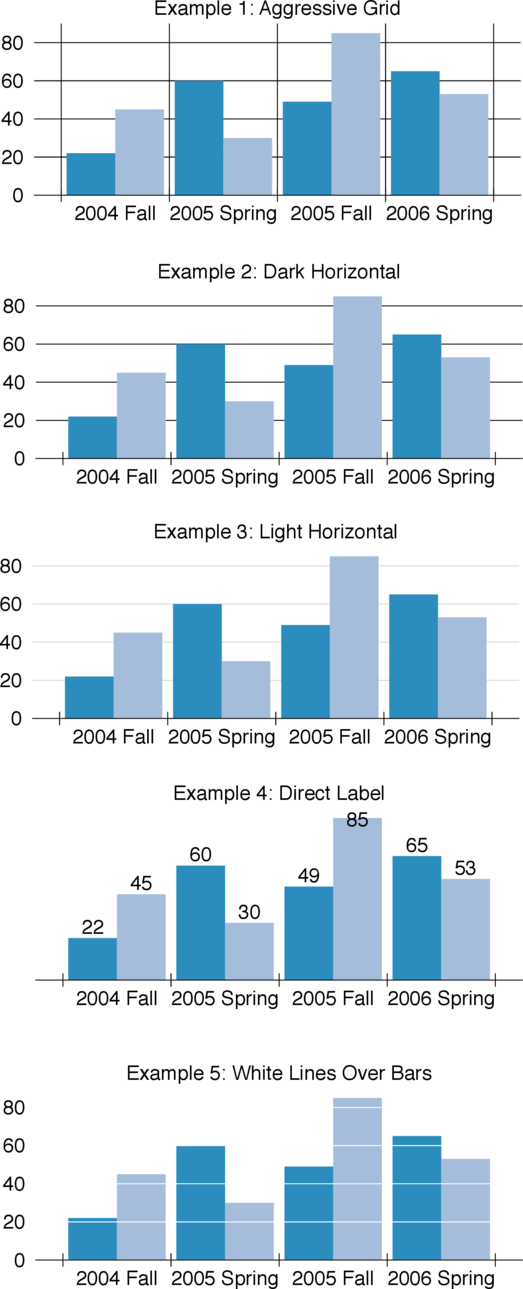
The human brain uses shading/color to automatically distinguish between foreground and background information (The Functional Art, p. 113). Dark lines, and a greater number of lines, make it harder for our brains to distinguish the important information (the bars or lines in a grap) from extraneous visual information (gridlines).
Edward Tufte specifically recommends avoiding dark gridlines in graphs The Visual Display of Quantitative Information, 2nd Ed., p. 113. Instead, he recommends light-colored gridlines or removing them entirely. He suggests two alternatives, seen below in Example 4 (direct labeling the bars) and Example 5 (white lines over the bars; see The Visual Display of Quantitative Information, 2nd Ed., p. 128.
I personally thing Example 3 (light gridlines) is the most readable. It allows the viewer to focus on the general trends of the data. But Example 4 may be better if it’s important to know the exact numbers each bar represents rather than a more general trend.
While Example 5 is functional, I think it is less visually appealing than Example 3. Perhaps this is the fault of the design of my example though. It’s an interesting technique worth considering, perhaps with a different color scheme (like this one).