Methods for optimizing visual presentation of healthcare-associated infection (HAI) data for the public
Last updated: July 30, 2016
Table of Contents:
Background
Hospitals in the United States report a variety of quality data to the Centers for Disease Control and Prevention (CDC). In turn, these data are made available to the general public by the Centers for Medicare and Medicaid Services (CMS). The goal of publishing these data is to increase transparency in the health care system and provide information for patients to make informed choices about which hospitals they use. As such, public reporting of hospital quality data is a key element of the Affordable Affordable Care Act1 and other U.S. healthcare legislation.2
Healthcare-associated infection (HAI) data are one type of hospital quality data that are reported by hospitals to the CDC. These data relate to preventable infections associated with a patient’s treatment in a hospital. HAIs affect 1 in 25 inpatients,3 and result in direct yearly medical costs of HAIs in the US as high as \$45 billion.4. Additionally, concern about HAIs is increasing as antimicrobial-resistant organisms become more common. These organisms cause infections that can be extremely difficult to treat.
While HAI data are an important indicator of hospital quality, we found that patient understanding of these data is much lower than is desirable.5 To address this problem, we developed a new method for presenting healthcare-associated infection (HAI) data to the public. Our goals were to allow users to easily perform the following tasks:
- Understand HAI data for a single hospital, in order to identify underperforming hospitals
- Accurately compare hospitals based on HAI data
This paper describes the methods we used to develop the new data presentation method. We believe these methods may be useful in the creation or improvement of other digital health information communication methods.
Methods
We used a four-stage process for developing the new HAI data presentation method:
- We defined a systematic design process. This was codified in a “design document” that described the goals of designing the data presentation method from a high level down to implementation details.
- We reviewed resources on effective techniques for data presentation.
- We created an initial implementation of the new data presentation method based on the design document and a review of relevant data presentation literature.
- We conducted user testing to iteratively refine the initial implementation of the new data presentation method.
These stages will be described in detail below.
Stage 1: Design document
We based our design document on the user-centered design principles set forth in Garrett’s The Elements of User Experience.6 Garrett recommends starting from a high level by defining the project’s objectives and the needs of the users (see Panel 1). Based on that, we defined the user needs more explicitly (functional requirements) and delineated the content that was currently available to meet these needs, namely the HAI data published on CMS Hospital Compare (see Panel 1). Next, we defined the structure, which combines the functional and content requirements fit together in a cohesive interface. Mockups were created based on the structure. The initial polished version (a design comprehensive7 or “design comp”) of the data presentation method was based on these mockups. Our design document is available here.
Creating a design document using this methodology is helpful in several ways. First, it avoids making limiting low-level decisions prior to addressing high-level issues. For example, deciding on the color scheme of an interface prior to defining the general purpose of the interface may artificially limit the interface’s functionality.
Second, it explicitly identifies any assumptions that are made as part of the design process, and provides an opportunity to test these assumptions in a systematic way if needed. We used one-on-one user testing (described below) to test assumptions made in the creation of the initial mockup and design comp for the data presentation method. For a different project, we might have tested assumptions at the top of Garrett’s design document hierarchy (i.e., assumptions about the needs of the user), using different methods such as focus groups or literature review, prior to defining lower levels of the hierarchy. Even if assumptions are not tested, it is crucial to systematically identify them and consciously decide that further testing is unnecessary. Implicit assumptions at the high level of a project can have a cascading negative effect, such as developing a time-consuming software component to fulfill a need that does not actually exist.
Third, it provides a common point of reference for collaborators working together on the same project.
Stage 2: Review of effective methods for data presentation
We reviewed a number of resources related to the effective presentation of data, including books by Tufte,89 Cairo,10, and Few.1011 Some of the most relevant principles our purposes found in these resources are:
- Preferring the use of colors to shapes for differentiating categories
- Reserving bright colors for important information
- Removing visual noise, such as grid lines and unnecessary cosmetic design elements (e.g. gradients in table cells)
- The use of “small multiples” to allow the user to see an overview of the data with a quick visual scan (see here for more information)
- The use of the “details-on-demand” design pattern from the Visual Information Seeking Mantra to show additional data contextually12
We have collected additional information about data presentation best practices, which is available online at https://masnick.org/projects/datatips/.
Stage 3: Initial implementation
Based on our data presentation background research and the design document, we created an initial implementation of the design comp (Figure 1).
Figure 1. The initial design comprehensive (“design comp”) of the new data presentation method, annotated to describe the HAI data representation elements and associated rational.
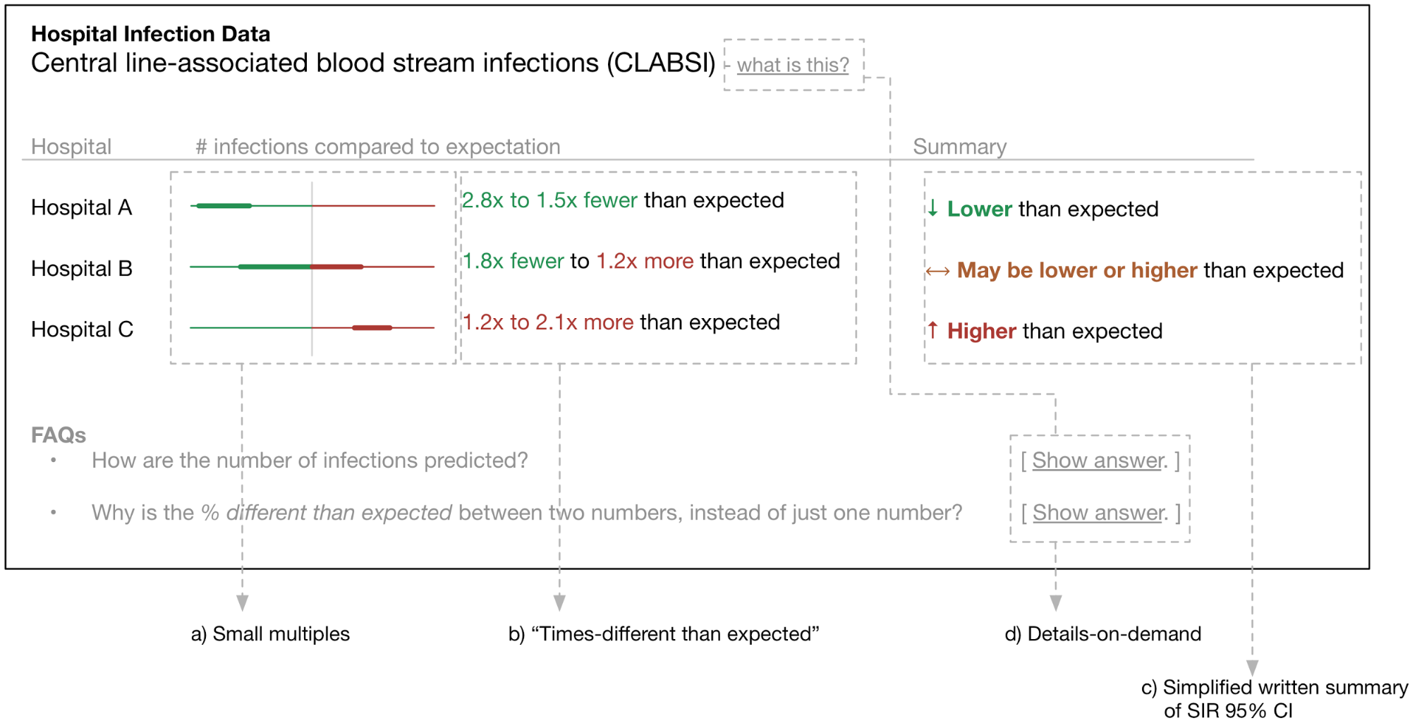
Features of the initial design comp include:
“Small multiple” graphics share an axis with a size based on the SIRs of the hospitals displayed. Figure 1 shows an axis that ranges from 3x fewer to 3x more infections than expected.
This interface de-emphasizes the point estimate for the SIR in favor of the 95% confidence interval. The reasoning behind this is that we hypothesize users will fixate on the point estimate and ignore the statistical uncertainty, which could lead to inaccurate conclusions.
Rather than a SIR and 95% CI, we use “times-different than expected” calculated from the SIR 95% CI. We hypothesize that this will be much easier for users to interpret. Hospital A in Figure 1 corresponds to a SIR 95% confidence interval of 0.36 to 0.65.
Written summary of 95% CI with simplified language and arrow glyph, replacing the “Better than/same as/worse than the U.S. National Benchmark” phrasing used on CMS Hospital Compare.
Details-on-demand12 for displaying additional contextual information to users.
A red→orange→green color scheme is used to indicate SIRs above, equal to, and below 1. The color scheme also ties together the elements of the table.
Stage 4: User testing and iterative improvement
The design document identified a number of assumptions that we wished to test. These included:
- Can users interpret the graphical representation of the data alone, or is additional information required?
- Do users default to looking at the “summary” rather than considering all the data?
- What information is needed in the “details-on-demand” for curious or confused users?
- Is the red→orange→green color scheme effective at communicating the summary of the numerical data?
- Do users interpret confidence intervals as confidence intervals?
- Are the words and phrases used (e.g. column headers) understandable?
- Is additional axis labeling necessary for the small multiples?
User testing was conducted with n=14 students at University of Maryland Baltimore County (UMBC) from April 15 to May 4, 2015. Students were compensated with a $10 Amazon.com gift card for an approximately 30 minute interview. The user testing study was approved by the UMBC institutional review board.
User testing participants were presented with a prose introduction to HAIs and a series of questions asking them to interpret data using the presentation method currently on CMS Hospital Compare. The purpose of this was (1) to introduce them to HAI data and (2) to compare their ability to interpret these data to participants in a prior study.5
Participants were then asked to verbally interpret data using an iteration of the functional prototype of the new data presentation method. Open-ended follow-up questions were asked based on what the participant said. Participants were also asked specific questions as necessary, e.g., “How do you interpret the colors in the interface?”
Participant feedback was used to iteratively improve the data presentation method in-between user testing sessions. A total of 10 iterations were tested (see here for details). The following are examples of changes and observations made based on user testing feedback:
- The “bar” style presentation method (v1 to v3) was replaced by the “dot” style presentation method (v4 onwards). This was due in part to fixation on small differences between the 95% standardized infection ratio (SIR)13 confidence interval (CI) that is represented by the bar. Small differences in the 95% CI are not practically relevant for differentiating hospitals. Some users also did not understand how the bars related to the underlying data, suggesting that this particular visualization would be very confusing to some subset of users.
- The red→orange→green was effective in communicating “bad”, “moderate”, and “good” performance respectively.
- A detailed explanation of how the summary dot and “high/moderate/low” ratings was made available through a modal dialog activated by a “Details” button for each hospital. The text of this explanation was iteratively improved based on feedback from users on what they found confusing. The “Details” modal dialog was designed to discourage direct comparisons of numerical SIRs among hospitals, which can lead to biased comparisons.14
- The “dot” style was more intuitive than the “bar” style, but there was some confusion related to having two columns of dots. Because the “Confidence in data” column could easily be described with words, we replaced the 2nd column of dots with words in the final version of the presentation method.
- Users were much less likely to press the “Details” and “Show how to read this table” buttons when they were neutrally colored (v8) compared to brightly colored (v9). We used the bright colors in the final version to enhance the discoverability of these details-on-demand features.
Results
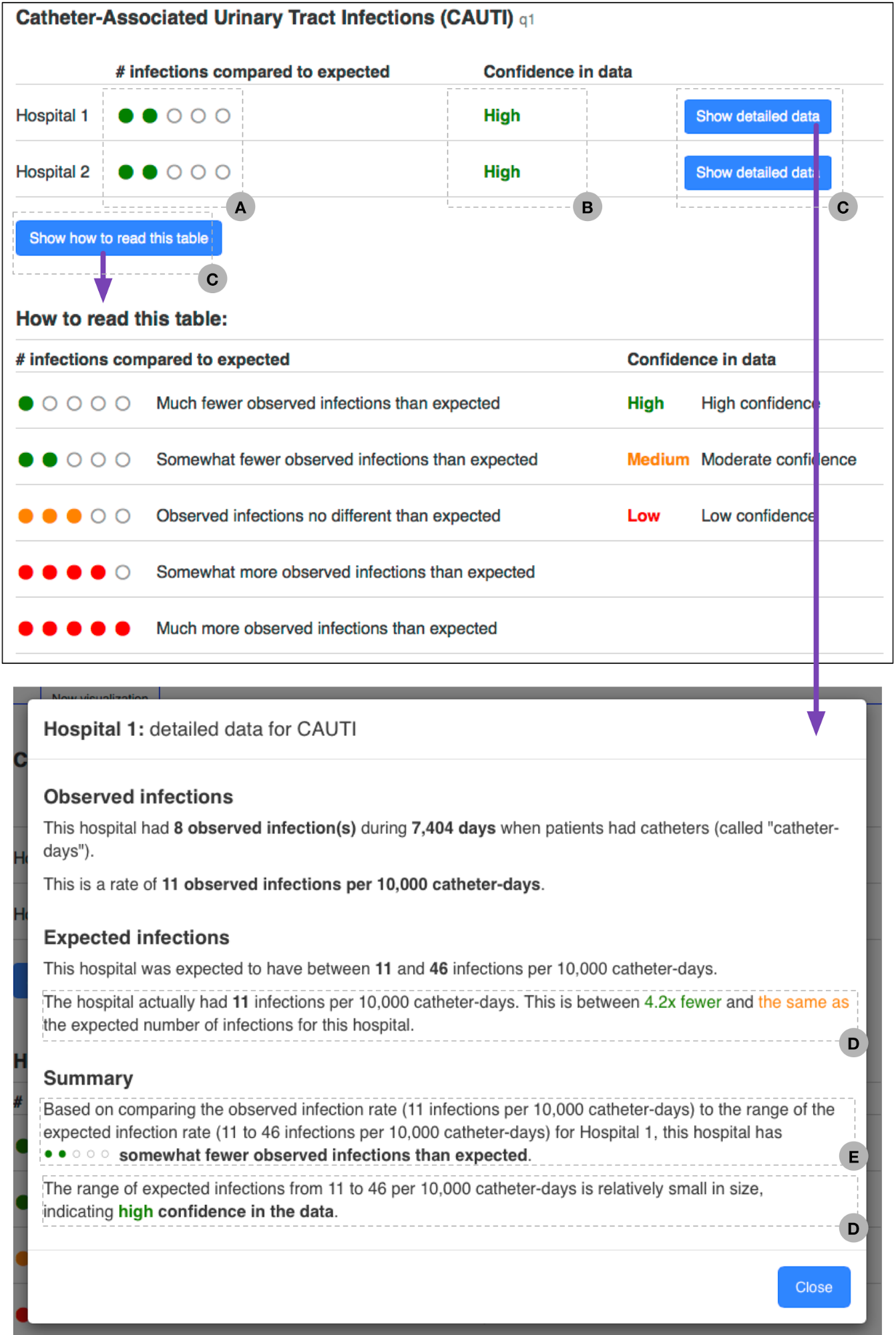
The final version of the new data presentation method is in Figure 2. We subsequently compared user understanding of this presentation method to that of users using a presentation method from CMS Hospital Compare using a randomized controlled study design.
Features of the final design include:
- Small multiple “dot” graphics provide a glanceable visual indication of the hospital’s performance for a HAI. This visualization technique also discourages direct comparison of numerical SIRs between hospitals. The underlying data are described in (E).
- Simplified summary of SIR 95% CI focuses on its width, indicating certainty in the data. This is further explained in (D).
- Details-on-demand12 for providing additional detail about the data to users.
- An explanation of the data underlying (B).
- An explanation of the data underlying (A).
Figure 2. The final version of the new data presentation method.
Discussion
We found the design methodology described here to be an effective and efficient way to create the new HAI data presentation method. Starting with a design document (Stage 1 as described above) provided a structure that guided the rest of the design process. We found that this structure was successful in encouraging a logical order in design decisions, from high-level (eg, overall project objectives) to low-level (eg, color schemes. We also found it easy to identify assumptions made while writing the design document. Some assumptions, such as the high-level assumption that users would want to compare hospitals based on HAI data were identified but not validated. (In this case, public reporting is mandated by law, and we already knew from previous research5 that the existing methods for presenting HAI data to the public are too difficult to understand.) We believe it is very valuable to explicitly make the decision that validating an assumption is unnecessary, rather than failing to validate it by default because there is no process to identify that a design assumption is being made.
Our review of the data presentation literature (Stage 2) was very helpful both in identifying deficiencies with the way HAI data are presented on CMS Hospital Compare, and in designing the new data presentation method. We strongly recommend reviewing this literature as part of the design process for any data presentation method. We have published a list of recommended references and a summary of our literature review here.
User testing (Stage 4) immediately identified flaws with the initial design of the data presentation method (Stage 3). These included poor understanding of the small multiples (Figure 1a) and fixation on small differences in the numeric SIR 95% CIs (Figure 1b). These issues were addressed with iterative changes to the design of the presentation method. We conducted user testing with students at the UMBC campus, with multiple user testing interviews in the same day. We were able to quickly make changes to the design of the data presentation method in-between user testing interviews, which allowed us to rapidly test different ideas. We found UMBC students to be ideal user testing subjects: they were all very engaged in answering our questions but had no prior knowledge of HAI data or CMS Hospital Compare. Recruitment of students was efficient: our strategy was to post flyers around campus advertising a \$10 Amazon gift card as an incentive for completing the interview, and provided a link to an online system where students could sign up for interview times.
Conclusions
We used user-centered design, a combination of a structured design process and iterative improvement based on user feedback, to create a new method for presenting HAI data to the public. We were subsequently able to demonstrate that the new data presentation method we developed was better-understood than the table currently used on CMS Hospital Compare.
Design techniques similar to those described here are common in private sector user interface design,15 but are less common in the public sector and in some types of enterprise software (e.g. electronic medical record software). The U.S. Digital Service is currently making an effort to improve public sector design practices with the introduction of the U.S. Digital Services Playbook (https://playbook.cio.gov/). This playbook recommends a number of the techniques we describe here in the development of governmental digital channels.
Health information is increasingly communicated through websites and mobile apps. It is critical that data and other information is clearly communicated through these channels, and is accessible through easy-to-use interfaces. To do this, we believe that it is necessary to apply techniques, such as user-centered design, that make it possible to systematically incorporate user feedback at all levels of the design process.
- Protection P, Act AC. Patient protection and affordable care act. Public Law. 2010:111-148. http://legcounsel.house.gov/Comps/Patient%20Protection%20And%20Affordable%20Care%20Act.pdf. [return]
- Colmers JM, Commonwealth Fund. Commission on a High Performance Health System. Public Reporting and Transparency. 2007. [return]
- Magill SS, Edwards JR, Bamberg W, et al. Multistate point-prevalence survey of health care-associated infections. N Engl J Med. 2014;370(13):1198-1208. doi:10.1056/NEJMoa1306801. [return]
- Scott RD. The Direct Medical Costs of Healthcare-Associated Infections in U.S. Hospitals and the Benefits of Prevention. Centers for Disease Control and Prevention. May 2009. http://www.cdc.gov/HAI/pdfs/hai/Scott_CostPaper.pdf. [return]
- Masnick M, Morgan DJ, Sorkin JD, Kim E, Brown JP, Rheingans P, Harris AD. Lack of Patient Understanding of Hospital Acquired Infection Data Published on the Centers for Medicare and Medicaid Services (CMS) Hospital Compare Website. Infect Control Hosp Epidemiol. [return]
- Garrett JJ. The Elements of User Experience: User-Centered Design for the Web and Beyond. New Riders; 2011. [return]
- Kurtz E, Lowe-Rogstad D, Landau S. Rethinking the Web Comp – Substance. http://findsubstance.com/blog/2012/12/rethinking-the-web-comp/. Published December 17, 2012. Accessed August 19, 2015. [return]
- Tufte ER. The Visual Display of Quantitative Information. Graphics Press; 2001. [return]
- Tufte E. Envisioning Information. Cheshire, Conn: Graphics Press; 1995. [return]
- Cairo A. The Functional Art: An Introduction to Information Graphics and Visualization. New Riders; 2013. [return]
- Few S. Show Me the Numbers: Designing Tables and Graphs to Enlighten. Analytics Press; 2012. [return]
- Shneiderman B. The eyes have it: a task by data type taxonomy for information visualizations. In: Proceedings 1996 IEEE Symposium on Visual Languages.; 1996. doi:10.1109/vl.1996.545307. [return]
- Note: CMS Hospital Compare uses standardized infection ratios (SIRs) to account for differences in underlying HAI risk among hospitals. SIRs are calculated by dividing the number of observed infections by the estimated number of infections for that hospital. Estimates are based on risk characteristics for the hospital; the characteristics used differ by type of hospital acquired infection. [return]
- Birnbaum D, Zarate R, Marfin A. SIR, you’ve led me astray! Infect Control Hosp Epidemiol. 2011;32(3):276-282. doi:10.1086/658331. [return]
- Design Kit. http://www.designkit.org. Accessed August 20, 2015. [return]